popular
电影电商 Cinematic Commerce
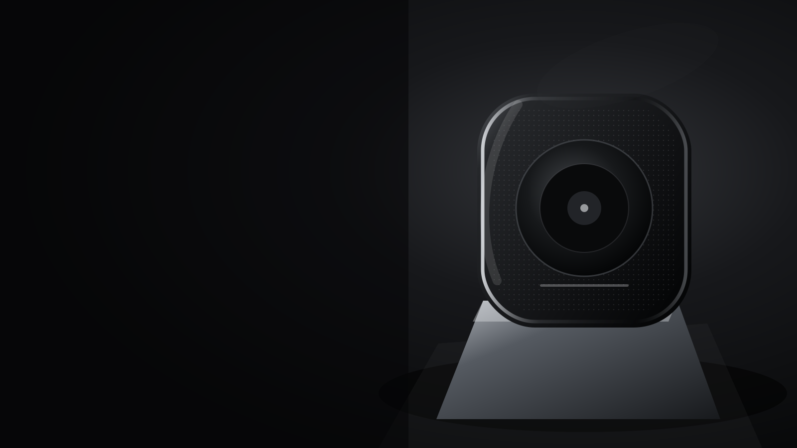
黑场、侧逆光与一件主角商品,像电影开场前的第一帧。
什么是 DESIGN.md适合: 高端消费品、科技硬件、时装与品牌发布
不适合: 高密度后台、长表单、需要多主操作的工具
夜幕商店
Specimen
The quick brown fox
primary
secondary
tertiary
background
surface
outline
muted
success
warning
error
onPrimary
onSecondary
onTertiary
onBackground
onSurface
h1 — Design systems for agents
h2 — Design systems for agents
h3 — Design systems for agents
body — Design systems for agents
label — Design systems for agents
caption — Design systems for agents
mono — Design systems for agents
PrimarySecondaryCard
DESIGN.md
---
version: alpha
name: Cinematic Commerce
description: A dark stage, rim light, and one hero product before the title card.
colors:
  primary: "#F4F2ED"
  secondary: "#A6A7AA"
  tertiary: "#D7D9DC"
  background: "#090A0B"
  surface: "#15171A"
  onPrimary: "#18181B"
  onSecondary: "#F4F4F5"
  onTertiary: "#18181B"
  onBackground: "#FAFAF9"
  onSurface: "#FAFAF9"
  outline: "#303338"
  muted: "#95979B"
  success: "#75A887"
  warning: "#D0A45B"
  error: "#D76C68"
typography:
  h1:
    fontFamily: Geist
    fontSize: 56px
    fontWeight: 400
    lineHeight: 1.02
    letterSpacing: -0.04em
  h2:
    fontFamily: Geist
    fontSize: 36px
    fontWeight: 400
    lineHeight: 1.2
    letterSpacing: -0.02em
  h3:
    fontFamily: Geist
    fontSize: 20px
    fontWeight: 600
    lineHeight: 1.3
    letterSpacing: -0.01em
  body:
    fontFamily: Geist
    fontSize: 16px
    fontWeight: 400
    lineHeight: 1.55
    letterSpacing: 0em
  label:
    fontFamily: Geist
    fontSize: 13px
    fontWeight: 500
    lineHeight: 1.3
    letterSpacing: 0.02em
  caption:
    fontFamily: Geist
    fontSize: 12px
    fontWeight: 400
    lineHeight: 1.4
    letterSpacing: 0em
  mono:
    fontFamily: JetBrains Mono
    fontSize: 13px
    fontWeight: 500
    lineHeight: 1.45
    letterSpacing: 0em
rounded:
  sm: 4px
  md: 8px
  lg: 16px
  xl: 28px
  full: 999px
spacing:
  xs: 4px
  sm: 8px
  md: 16px
  lg: 24px
  xl: 32px
  2xl: 48px
  3xl: 64px
components:
  hero:
    backgroundColor: "{colors.background}"
    textColor: "{colors.onBackground}"
  media:
    backgroundColor: "{colors.primary}"
    rounded: "{rounded.lg}"
  list-item:
    backgroundColor: "{colors.surface}"
    textColor: "{colors.onSurface}"
    height: 44px
  footer:
    backgroundColor: "{colors.background}"
    textColor: "{colors.muted}"
---

# Cinematic Commerce

## Overview

黑场、侧逆光与一件主角商品,像电影开场前的第一帧。 整体气质是 画廊留白、艺术化不规则、动效 流畅 CSS 动效。品牌语气:cinematic / restrained / product-led。密度 2/10,变化 8/10,动效 6/10。 材质:近黑影院画布、全出血商品影像、超大轻字重标题和单一白色胶囊 CTA。不要仪表盘卡片或多主操作。

How to use: 把本文件放到仓库根目录。在 Cursor / Claude Code / Codex 提示词中写:请阅读 DESIGN.md 并严格遵守其中的 tokens 与 Do/Don't。

## Colors

Semantic roles for the dark theme. Keep a single accent; do not introduce a second brand hue.

- **primary** (`#F4F2ED`)
- **secondary** (`#A6A7AA`)
- **tertiary** (`#D7D9DC`)
- **background** (`#090A0B`)
- **surface** (`#15171A`)
- **outline** (`#303338`)
- **muted** (`#95979B`)
- **success** (`#75A887`)
- **warning** (`#D0A45B`)
- **error** (`#D76C68`)
- **onPrimary** (`#18181B`)
- **onSecondary** (`#F4F4F5`)
- **onTertiary** (`#18181B`)
- **onBackground** (`#FAFAF9`)
- **onSurface** (`#FAFAF9`)

## Typography

Hierarchy comes from weight and size, not from shouting. Body line length stays near 65 characters.

- **h1**: Geist 400 / 56px / 1.02 / -0.04em
- **h2**: Geist 400 / 36px / 1.2 / -0.02em
- **h3**: Geist 600 / 20px / 1.3 / -0.01em
- **body**: Geist 400 / 16px / 1.55 / 0em
- **label**: Geist 500 / 13px / 1.3 / 0.02em
- **caption**: Geist 400 / 12px / 1.4 / 0em
- **mono**: "JetBrains Mono" 500 / 13px / 1.45 / 0em

## Layout

Spacing scale: xs=4px, sm=8px, md=16px, lg=24px, xl=32px, 2xl=48px, 3xl=64px.

iOS:触控目标 ≥ 44pt,尊重 Safe Area 与 Dynamic Type,图标用 SF Symbols,导航使用 Large Title / 分组列表。

Web:移动优先,<768px 单列,正文 ≥ 16px,标题用 clamp(),容器 max-width 约 1120–1400px,全高区块用 min-h-[100dvh]。

Every element occupies its own spatial zone. No overlapping hero text. Collapse multi-column layouts below 768px.

## Elevation & Depth

- sm: `0 1px 0 rgba(255,255,255,0.08)`
- md: `0 24px 70px rgba(0,0,0,0.38)`
- lg: `0 48px 120px rgba(0,0,0,0.56)`
- surface: `hairline`
- recipe: 近黑影院画布、全出血商品影像、超大轻字重标题和单一白色胶囊 CTA。不要仪表盘卡片或多主操作。

阴影带背景色相。高密度布局可用细分隔线代替卡片。
动效已接线:按钮按下、开关、滑杆和画布明暗使用 520ms / cubic-bezier(0.22, 1, 0.36, 1),弹簧 stiffness 100 / damping 20。液态/黏土按压用弹性;野兽按下吃掉硬偏移;新拟态按下变内凹。


## Shapes

Radius scale: sm=4px, md=8px, lg=16px, xl=28px, full=999px.

## Components

- **Hero** (`web.hero` / left / lg): Hero 使用 left 布局,最多一个主 CTA,禁止「Scroll to explore」。
- **媒体位** (`media` / wide / lg): 几何封面位或本地图片,圆角跟 tokens。禁止远程图。
- **列表行** (`list-item` / chevron / md): 行高至少 44pt,标题 + 说明,右侧可放 chevron。
- **页脚** (`web.footer` / default / md): 页脚克制,链接分组清晰。

## Do's and Don'ts

### Do
- Use semantic color tokens, never raw hex in components.
- Keep a single accent; hierarchy comes from type weight and space.
- Define default, hover, focus-visible, pressed, disabled, and loading states.
- Meet WCAG 2.2 AA contrast for body text and interactive labels.
- Touch targets are at least 44×44pt on iOS and 44px on web.
- Let one full-bleed product image own the composition.
- Use oversized light-weight type and one white capsule CTA.
- Keep secondary controls quiet enough to preserve the title-card rhythm.

### Don't
- Do not use Inter as the display face for premium work.
- Do not use pure black #000000 for large surfaces.
- Do not add neon outer glows or custom mouse cursors.
- Do not ship three equal feature cards as the default layout.
- Do not hide focus rings or drop below AA contrast.
- Do not turn the landing page into a dashboard card grid.
- Do not use colorful gradient CTAs or multiple primary actions.
- Do not place logos or third-party marks in the hero media.